Find your tribe

I am just now relaxing from back to back weekend long retreats with a tall glass of wine. It is the season to gather in like minded groups to share interests and friendships. My first retreat was with my quilt guild of ladies who are good friends. I do have a core group of best buddies in this group but also like minded friends who support and encourage each other in a very positive way.

It is fun to be around such people, to give them encouragement as well as accept their encouragement. I accept each as they are without judgement but it is easy when you find that is given as well.

This last weekend the retreat was with a group of very talented fiber artists. It always inspires me to meet with this group of creative people. Mostly because fiber can be so many different things. Paper making, wool felting, fabric collage, sculptures from  weaving, whatever inspires you that can be connected to fiber in one way or another.

This group is also my tribe. They are artists one and all, so that makes it a given for me. Yet it is more than a group of artists getting together. We are all more than happy to share a technique, style or method. As such I was honored to be asked to teach a 4 hour workshop on embroidery. Thank you Charlene Fullerton. Especially considering I had never taught a workshop before this conference.

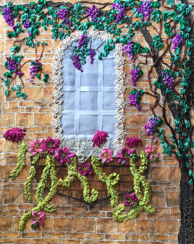
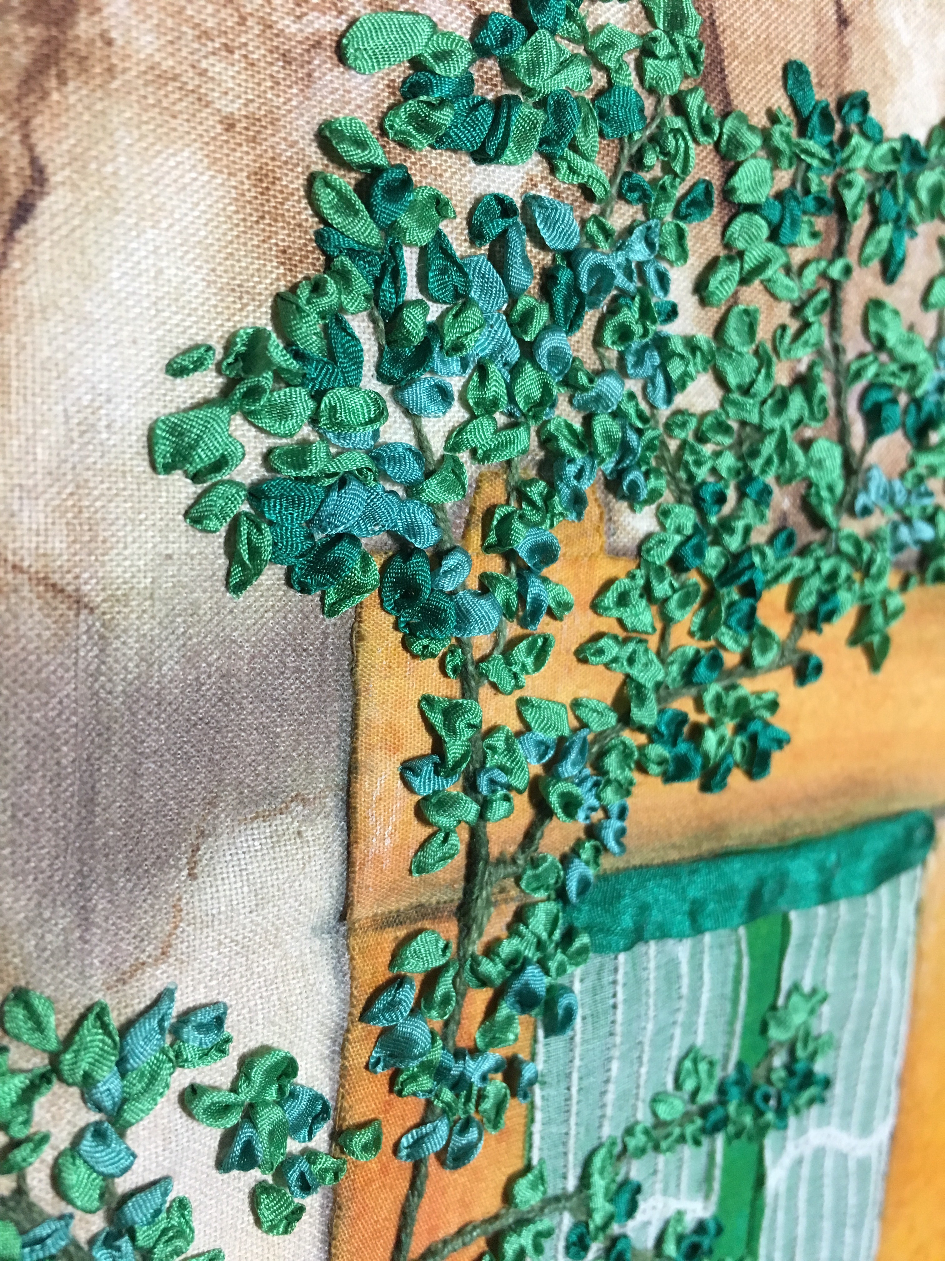
As I decided what to teach I chose  to teach my basic stitches that I use in my artwork. They tell writers to write what you know. I knew from my technical teaching in my full time work you are most effective teaching adults what is second nature to yourself.

I picked 5 stitches I know by heart, prepped with a written and illustrated handout of those stitches and gathered the materials and tools to teach those stitches. My previous teaching kept me from getting too nervous. However this was the first time I would teach to such a talented group of fellow artists. Add the unknown factor of never before attending this groups workshop retreats. Talk about possible stress, ugh!

Once I got to the event and connected with friends along with making new friends, I had no fears or worries. I was well prepared, ready to prove my worth but not anxious to see it. I even surprised myself by being able to demonstrate four of those stitches upside down for the group. I did not prepare to do that ahead of time either. Guess I have watched Sewing with Nancy on PBS too much. Just seemed natural.

I scored with this approach, being able to assist one student that had tried for several years to do a stitch to no avail. It is a personal accomplishment for me that I was able to gently explain what she had been doing wrong. I then allowed her to practice it enough to “get it” and produce the stitch several times on her own.

I have to admit I had not considered this possibility but just went with the flow. Yes I do get a charge from this kind of discovery. I also celebrated this with the group. As an added treat I received more than one accolade from my students for what they learned from me. SCORE!!!

I recall Sally Fields saying ” you like me, you really like me!” This doesn’t mean I wasn’t confident I could excel in teaching this class. However with like minded artists it is a golden feeling when you are accepted for what you can do, how you can show what you know and who you are as an artist.

I HAVE found my tribe even if it is more than one group. My life is full and rich with each of these like minded people. We laugh, we cry (mostly from me laughing too hard), we support and encourage each in their own journey. I know I would not be the person I am now if not for you. Thank you.

I will now share the beginnings of my latest artwork. A seascape with autumn colors of gold, purple and deep maroon. This is a tease for the finished work that should be completed by Friday this week. Another new piece for my two person show in May.

The beginning stages showing the base batik along with laying out the stringy yarn for a background. (picture deleted due to corrupted file)

Quite a bit further along, this includes a lot of scrunched purple velvet for the foreground, netting over the stringy yarn with more of the same on top of the netting to show depth. Stitching to emulate fan coral in a golden orange thread and couching of fushia trim for a funky seaweed. At this point the rise of the velvet is looking like a volcano. Need to resolve this or make it a focal point. What do you all think? (picture deleted due to corrupted file)

Things are springing up

This year winter has been different. Very little snow or rain. Some days in the 70’s and other days gray as the wool on a sheep.

During this time of year I am mostly inside. Yet with the warm sunshine I have been out and about finding signs of an early spring.The yellow in these crocus are just wonderful and says spring to me. I really enjoy the contrast of the purple flowers with the exact same hue of yellow in the center no less!!  Now do you see why I am so fascinated with nature.

I know that spring means new beginnings, new growth, an awaking from the slumber of winter.  I have been busy working on new work and assessing what I will include from my current art for the two person show I will have up in May. I have heard other artists call their work as their baby. You mold it, create from your vision and once done hand it off to someone else that appreciates that creativity. It is a lot like a child but I have never really thought of my art work in this way.  I see this as a creation of mine  for sure but once it is completed or more like once I am almost done, I am already thinking of the next piece.

However it is good to see someone else appreciate the work you put into a piece of art. It is also good to see older work compared to what you are currently doing. I see progress and how some things have worked or not worked. I see new growth in each new piece I have done for this show. It makes me so happy to be able to reach the level that I have envisioned. I know that with this I will judge some of that older work as not acceptable. That does not bother me just part of the way you grow.  I also see the seeds of my personal growth blooming with my increased acceptance in shows and confidence.

I really enjoy showing everyone this progress and this is my most recent one. I wanted to continue with a smaller piece. It is a challenge to not overwork but get the rhythm and movement that I often use in my art. I also wanted to see if I could complete one of these small pieces in a short period of time. I have wanted to do a field of poppies so started with a 8 X 10 stretched canvas.

img_0502
I used alcohol markers in a series of greens and browns in short diagonal strokes to mimic a field of grasses. I kept puttering with the color then left it to dry overnight. I used a variety of green hand dyed silk ribbon for grasses stitched in the opposite direction for grasses. I added    green threads for contrast and texture. I did not want to cover the background completely so kept the stitching sparse. I also left some areas open were I would place the poppies.

I used a very dark green thread for the flower stems. To keep them from mixing with the other threads I placed a base thread down. Then I wrapped them in a satin stitch that raised the stem adding a rounded top for the calyx. Finally I was ready for the flowers. I found a orange red bias silk about 3/4ths of an inch wide. Cutting a length I gathered it up pulling it into a ruffled circle.  I then placed it on the top of the stem adjusting the gathers as needed. I had a lot of fun with this step making a side fold over or keeping it completely open. Lastly I put black beads in the center of each flower. Completed in two days too!

Guess I am springing forward in many ways.

Empowered

As I see it lots of people know what to do but few do what they know.

Reading the blog artbizblog.com last week the author, Alyson Stanfield asked what one word would we use for 2017. After some thought I chose empowered.

I read books and studied the Small Business Admin. site over the years while working at a non art job. All of this research stewed as I worked towards my retirement. I set a 5 year plan right before my retirement date which started with producing art and entering shows.

When I got accepted in different local juried shows I knew I was on the right path. As the excitement of retirement came near I knew it was time to decide where that path was leading. What was the dream? Acceptance by my fellow artists? My own solo show? Sharing my vision of natures beauty with the world? Making money from this art?

All of these questions were actually valid goals. My dream is a mix of all of them. Yet I had no plan, no way to get down the road further. Time for some research, head scratching and writing. I became more involved with a fiber arts group. I became a member of in order to enter their show. One of my first juried show acceptances was from this group. In fact they used my work on their promo postcard for the show. Thank you Missouri Fiber Artists- MOFA. You gave me validation and acceptance amongst my fellow artists.

I continue to enter shows getting accepted in national and more prestigious local shows. I have blogged already about my commission work, check that off the list. My friends can see the progress of my art and see the beauty of nature I see. I know I am heading on the right path and in the correct direction.

I recently found out I was accepted for a two person show in May of this year. I will be teaching an embroidery class at a retreat in March with my MOFA group. A fellow artist told me about a local juried show I had never heard of before. Got into the show with two pieces, yea!!

The show is called Marti Gras 2017 put on by the Leawood, Ks arts council. It will held Friday February 17-19th at the Lodge at Ironwoods park, 147th and Mission, Leawood, Ks. Opening night reception is Friday from 6:00-9:00 with a $15.00 fee. Saturday and Sunday free admittance 10:00-4:00. I will be at the opening so join me if you can. The two works accepted are Fireflies and Wonderful Window Box shown below.

I am empowered with the joy of my journey because I found the way to take action towards what I am meant to be.

Keirnan-Hale Fireflies
Fireflies 12 X 12 stretched canvas, fabric collage, sequins, silk ribbon and embroidery

img_0275
Wonderful Window Box 14 X 11 fabric collage, trim, silk ribbon embroidery and colored pencil

January musings

I have blogged for a year now and see that art and how I do that art is my biggest subject. January has always been the month to look back at my accomplishments from the year before to see how far I have come. It is also the time to see what has worked and adjust my goals and plans for those goals as need be.

As part of my on going goal I started another new piece of art. I have several cardinals that I enjoy watching outside my window this time of year. As the male bird begins to turn brighter red I know winter has really set in. Something about their sweet call and perky pointed top feathers just makes me smile.

With the soft muted colors of a wintery forest I have to add the contrast of a bright red cardinal. But how do I depict the three demension of snow without making it just gray and white? Looking thru a search of winter photos on-line I see there are many colors in the shadows other than black and gray. There are purples, blues, greens and gray in the ditches and valleys. The white of snow reflects yellows and reds too. This gets my juices flowing so time to get these ideas into a piece of art.

I started with a background of blue gray and muted white, a middle tone of the same blue gray and a hand dyed white with light streaks of blue for the snowy field. Next came cedar trees muted in a blue and green. I fussy cut them out from landscape fabric then bonded the blue to the background and the green in the middle. Out came my colored pencils, adding more white, light blue and gray green to emphasize snow on the trees.

(picture deleted due to corrupted file)
A fence row in the background helps to add depth along with colored pencil to anchor the trees. I wanted to show fluffy snow so glued down strands of white cashmere roving that gave the depth and fluffyness of snow banks. Roving is a long and narrow bundle of fiber. Rovings are produced during the process of making spun yarn from wool fleece, raw cotton, or other fibres. I added a pair of cabins in the middle of the foreground. The cabins are framed with tall cedar trees. The trees have to have snow too, so stitching over the green I used a white silk and wool mixed thread that worked perfect.

I decided on a pathway to the cabins leading to one of the tall cedar trees. I added brown and black leading to the tree and cabins in a meandering diagonal line to move the eye across the piece.  I darkened the shadows in front of the tree lines and added purple to the fields behind the fence line. More cashmere roving was added all thru the piece along with colors to show valleys and clumps of snow.

(picture deleted due to corrupted file)
After looking at this stage the next morning I think it is looking too gray and the black appears dirty. Though snow gets that way after awhile this was not my intent. There is a bit of purple on the lower left side so used this along with a red purple to add some warmth to the pathway. Used these same colors on the shadows in front of the trees in the foreground. I worked on the tree lines adding white and a pastel blue gray to show snow on the trees. Blurred the lines to keep the distance of these within the picture.

But wait, don’t forget about the cardinals! The scale or size of the bird will be tricky. I also need something like a fence row for them to be perched on. I try stitching the beginning of a bird on a limb of the trees in front. Don’t get very far when I realize it is too hard to see the bird. Scratch my head, get something to eat then I remember I have fabric that has a medium gray stone that would be a perfect contrast to the bright red of a cardinal.

img_0568
After I pull out the stitches of the cardinal in the tree I see that the rock fence line works wonderful. I added red dots of French knots in two of the cedar trees. The same white thread in those trees were used in the rock wall for snow. Some thin gray green thread was stitched in short stitches around the foreground trees to imitate stubby grasses. Finally the red cardinals are added on the rock walls. I do believe this is done though I may decide to pull some stitching on the bird at the far left. The scale seems a bit too large. Yet my hubby told me to leave it alone.

Now to consider a name, perhaps Winter Wonderland? What do you think?

What one can see

The last “super moon” of the year was tonight. There are reports that we won’t be able to see another this close to the earth until 2024. As I look out my kitchen window to catch a glimpse I wonder who else can see this bright beautiful sight. 

Could it be my realitives in New York, Florida, Tennessee or all my good friends in Kansas City and other places? If so can they see this also? Makes me think of the saying “love you to the moon and back”.  Yet what one actually sees depends on your personal perception, location and circumstances at the time you view it. 

Artists face these circumstances with every work they create. Art is a form of communication, sometimes very obvious other times hard to perceive. I have always thought of doing a dark night sky, stars blazing, moon bright and big with the shadow of moonlight showing a deep, dark forest. Another idea that I need to work out. It makes me wonder if I could show or communicate that beauty of moonlight across the forest.

So I decided to step out in the cold dark night to take a picture of this wonderous moon. I usually get good pictures from my phone but this isn’t so good. The distance from my back porch and the brightness of the moon didn’t translate well. But here is the picture. 

Seeing what I can see from this picture I am seeing something totally different on my own. It deepens my understanding of the difference from what I perceive and what is actually there. As an artist this is a constant, something that can get in the way of trying to communicate a feeling or vision. Everything is affected by how you are feeling at the moment, your own memory of that moment and what you can see. I strive to communicate that with each new art work. I only wish that those that view my work can see what I see at that moment. 

Small ideas become big

I set a goal last month to complete 10 new pieces of work before April 2017. I do need to increase my inventory and as I have said before I have a lot of ideas. Considering my usual format of 11 X 14 I begin to map out my weeks to see if this really was feasible. If I had nothing else on my plate I could realistically complete two a month. 

This time of year is busy though, with family, holiday parties, get togethers and gallery openings to attend. I know that I need to enjoy myself but also need to take my art seriously. It then occurred to me that I could rethink the size of my work. I had a lot of fun working on the 12 X 12 piece maybe go smaller than my usual size? 

I use the 11 X 14 size because it is a standard size for framing but also it works well for landscapes or turned 14 X 11. I took this in consideration while at the art store. Turning around a corner in the store I find a pack of  8 X 10 museum wrapped canvases. The 5 canvases are wrapped around the wood frame so you really don’t need an additional frame. 

This is what I used for the 12 X 12 piece I had done earlier so I know these will work for my fiber art. This size will fit the ticket perfectly, they will be easy to work on and I can get it completed fairly quickly. 

I decided to wrap a base fabric around to back of the canvas similar to wrapping a present. I mitered the corners and glued the fabric securely to the framing around the back. The base fabric represents a plastered wall with interesting cracks and coloring. I used colored pencil on the fabric to emphasize the cracks and fissures on the wall. I used a yellow gold fabric to show a stone framed window on top of the base. 

The green fabric will be shutters of a window then curtains in white on top of the green. 

I search my stash of antique laces to use as curtains and find one that has an interesting scallop along with vertical lines. This will help move the eye downward to the base of the window frame. I decide to put three flowerpots in the window with some greenery planted. 

I stitched down a wide dark green silk ribbon to anchor the curtains to the window. I add more colored pencil to the stone windowframe to add depth and highlights. All the while I keep adding more color to the plastered wall. 

My plan is to add a wandering rose vine across the window from the left in a diagonal. This will add contrast from all the vertical lines of the window. I take my time with the vine/stem knowing that most of it will be covered with leaves. But you always need a foundation before you add the next step. 

Using four different green colored silk ribbon I start adding the leaves using a simple ribbon stitch. This took the majority of the time to complete but they really turned out wonderful. Here is a side close-up to show the leaves.

Once I completed the leaves on the rosevine I added green leaves to one of the flowerpots, some tan colored stems to the middle pot and a tan and green stem on the last pot. The roses in a red silk ribbon are next, I used several different stitches to show variety and size. 

Here is the completed piece, done in a week no less. I did have to remember I was working small as I did the roses, the scale I usually work is larger. Yet no problem here long as I keep things the correct size. As I finish the roses I see I need to darken some of the shadows around the window to anchor it to the wall. I also need to think on a title. Maybe Red roses, Fading beauty or something else. Take a look as I ponder the title. If you have a suggestion post it in the comments. As I look at this myself I see that you can make a big impact even with a small piece of art. 

Thankful

Yesterday being Thanksgiving here in the U.S. made me think. Think of what I am most thankful for in my life right now. I am thankful for love of family, the wide range of good people I call friends. The roof under my head, the good food and the lack of worry I have within my life now. 

I am so grateful for the purpose I have each day since I retired. The knowledge that I have a creative mind, one that is constantly spurring me to make something new. I am so filled with ideas I wonder if there could be more than 24 hours in a day. 

I am grateful for my artistic ability. This came more to mind when I delivered the commission piece I walked you all through with my last blog post. The buyer is color blind yet he truly enjoyed this artwork. Knowing the thrill of color in nature, one of the driving forces in my art it made me think what it would be not to be able to see that color. 

I know that color blindness usually happens when someone cannot distinguish between certain colors, usually between greens and reds, and occasionally blues. It commonly starts at birth so not knowing what is green or what is red would not be an issue if you had never saw these colors before. 

My friend says he sees these colors in different shades of gray. The master oil painters would often do an under painting of grays and blacks to obtain the correct value. It is also a good way to keep your colors clean and vibrant while showing dark and light. I wonder if I should find a way to use this in my fiber work. Another idea that will brew in the back of my mind. 

So here is the finished commission, Tortuga Sun. It is 11 X 14 with an collage of fiber with a lot of colored pencil on top of fabric for the water. The palm frons are from fabric that are printed, fused with iron on bonding then cut out and ironed on. I really enjoyed working on this and hope you enjoy it as much as my buyer did. 

New ideas

I was successful enough with my first commission in February this year that I am doing another. 

I am not as intimidated now as I was with the first picture. Yet it still has the pull for me to match the details of the photo I am working from. It is the small details that we remember. Be it in a piece of art, a distant memory or the smell and taste of grandma’s sweet potatoe pie. 

Details have been my focus lately coming from an amazing art business conference recently. If you are an artist who wants to understand the business end of selling art I highly recommend you start with Alyson Stanfield’s book “I’d rather be in the studio.”  Very good resource but also check out her website ArtBizCoach.com and her blog at ArtBizBlog.com

The details for this work seemed a bit vague. It started with a photo taken by the buyer. This is a scene looking out at the ocean from his sisters rental property in the Tortugas. Lots of sea, a few islands in the background and palm trees in the foreground.

Looking at the details I see the water is calm, the sky is plain with a few clouds and the palm frons are interesting but have no real color to them. How to add some interest without changing these details too much? I know that this photo is a good reference but it also can fool the eye with the color in the photo. Take the palm frons. If I make them all black, in shadow as the photo shows it will be hard to see them as “alive”.  

I have to add more clouds to the sky for interest. Otherwise this space will read flat and boring. So this is a detail that will be altered. The sea area is very cool and calm may need to add some waves for interest. The rocks in the foreground are interesting but I am thinking of adding more for interest in this area. 

Here is the beginning with the sky and sea done with colored pencil on the collage of fabric that I fused down to a base. I often take a photo of my work while working on the piece. It makes the eye see things differently, catch color conflicts and any area that is not complete. 

Viewing this picture I see that the hue of the blue in the sky and sea are too similar. I want to show distance thus I will need to lighten the sky by adding some light gray, a small amount of yellow for warmth and white. I also want to add to the waves. I like the movement so far but it will help to move them across the whole length of the picture. 

As I analyze the base colors I am anxious to get to the foreground details. I start looking thru my stash of fabrics. I find some rock fabrics in different sizes. I locate a brown batik that will be a good base for the tree trunks. I find a sandy colored fabric for the beach behind trees. The small patch of green lawn is very bright. I find the perfect piece knowing I will add the dark shadow of the middle tree with fabric markers. 

Here are some of those fabrics before I altered them. 

Now this next picture is after I made the changes to the sky and sea, added the trees and foreground fabrics. I used both colored pencil and fabric markers to all, adjusting the color as I placed each piece. I cropped this picture lower than the finished piece on the bottom. This way you can see I really did use that tan sandy fabric. With the blue gray over it you may have never known. However I knew I needed the warm of this yellow tan. 

I see I got carried over with the clouds but some of them will be covered by the palm frons. I will need to add some shadows to anchor the rocks on the beach line. Then to figure out what fabric or technique to use for the palm frons. Need to get busy. Next post I show you the finished piece. 

Color

Life as an artist is an observant one. I often see things differently than most but I also sometimes let my busy everyday life get in the way. I attended a quilt guild meeting last night. We had a guest speaker who spoke about color and how it can be used.

It was a wonderful talk. One filled with info and encouragement for those that believe they know nothing about using color and the basic ideas of color theory.

I was taught a lot of what was discussed first by my artist mother then formally in art classes and at college. Yet even then I knew that if I could just observe what was around me from nature I would never go wrong.

When thinking of greens in particular to be used in an art work there really is no green that does not go with each other.  This was brought up in our lecture with the explanation that we live mostly in a green world around us everyday. I totally agree with this statement. It works especially well when the greens are analogous, meaning that they range in at least three hues on the color wheel.

Okay enough words here is a visual that I want to point to that explains this better. Below is a Van Gogh picture titled Green Wheatfield with Cypress.


First you see lots of greens, dang it fills two thirds of this painting. Yet it is not a flat opaque color of green. Looking at the foreground you see dark greens but there is stroke of blue to indicate it is in shadow, yellows and even a bit of orange other than the greens you can see.

The middle of the painting repeats these same colors without the blue. There are more orange and yellow greens. A new element is white added on top of the greens to indicate coolness. A middle ground can often be the focus of a picture. However here it is cooler, a way to show depth from the foreground to the background.

This is the way we see depth in nature too, when the light is not in high constrast. Van Gough also uses the texture of his pallet knife for this visual illusion. That is a different subject for another post.

Moving to the background you see yet another repeat of these greens. There are blue-black greens that mimic the dark greens in the foreground. Do you now see the yellows both on the rooftops and in the clouds? The blue of the sky is a clean bright blue but it is also in the greens. This is what makes the green color in this picture so interesting. They are clean, in the same hue as each other. This is what makes the painting so compelling.

How does this apply to quilts let alone art quilts? It is all the same, color rules no matter what you use to express your creative spirit. If you want clean and clear colors use analogues colors. I have discussed greens but they could be purple, reds or even blues.

I often start an art work thinking of the lighting and the mood I want to express in that work. I have found using low light greens with a bit of contrasting purple can evoke a sense of the serene. Think of moss green, olive green, light tans and browns and it is so serene. This was my intent with this work I call Serenity.

6927562111_fe05b28709_b

As you can see the background of this work is mostly muted olive green, yellow and purple. Yet the colors are all in the same tone with each other. None of the colors are brighter than the next. This evokes a quite and serene mood, one of calmness.  There is rhythm with the repeating lines of the poplar trees. To show that there is space between one set of trees from the other I used the same muted purple and some rosy pink in the background tree trunks.  The leaves are a muted blue green in different shades. I also have repeated the purple from the foreground in the small lavender colored trees in the background.   Finally I used cream for the foreground tree trunks and a light olive and yellow green for the leaves.  Color is important for each and every piece of art work. It evokes depth, feeling and mood. Next time you are looking at a piece of art or even a quilt perhaps you can see how the colors are being used to evoke depth, feeling or mood.


Why am I an artist?

I came across a passage from another writer that truly expresses what and why I consider myself an artist.

This is from “Letters to a Young Poet” by Ramien Maria Rilke.

I know no advise for you save this: to go into yourself and test the depths in which your life takes rise; at its source you will find the answer to the question whether you must create.  Accept it, just as it sounds, without inquiring into it.  Perhaps it will turn out that you are called to be an artist.  Then take that destiny upon yourself and bear it, its burden and its greatness, without ever asking what recompense might come from outside.  For the creator must be a world for himself and find everything in himself and find everything in himself and in nature to whom he has attached himself.

This all can be rather high handed in wording but it does ring true for me.  I know I have said this before but I have always considered myself an artist.  No matter what I do, no matter what job or action I take I know I see things in an artistic, creative way. I do not see this as a burden, however it can become one while you have too many ideas in your head while you are trying to get to sleep.

It first became a way to spend more time with my artist mom away from my brothers and sisters.  My mom nurtured my potential, saw that I had a different way of seeing the world around me.  I saw her love of nature and how it has an infinite source of beauty and ideas.  Once I was able to capture that beauty with ability and talent I did take on that destiny of calling myself an artist.  I recall the very first award I received for that talent.  It was a simple line drawing competition for a bank but I can still feel the thrill of getting money for my art.

I went to art school with this same thrill and acceptance of my artistic ability.  Once out of college I did not find a job in the art field.  Yet this did not deter my need to continue to find my artistic voice.  I took classes, met other artists, painted a bit, got into a few local shows with a painting or two but somehow I knew that I had yet to find what would be unique to me.  I experimented with textiles, using crazy quilting as a springboard.  I took a class from Judith Montano in Omaha, Ne at a crazy quilt retreat.  I took this method of fabric collage to create underwater seascapes and ran with it.  It was so intuitive to me, use fabric, beads, ribbon, hand embroidery and whatever else to make art.

Once I felt comfortable in this new method it led me to use fabric and embroidery as you would use paint and brushes.  I love the tactile feel, the use of line and color in the same manner as a painter.  Perhaps it is also a connection to my grandmother who was a seamtress by trade but an artist by night.  I do wonder how I was able to grow to use this as my medium but it is true to my artistic soul.  I see beautiful things in nature, then use this method to express that beauty.

I am sharing one of my early pieces, done in 2013.  I did a lot of tiny French knots for the sheep’s wool coat using a silk and wool thread.  It was actually very soothing to work on due to the repetitive nature.  The bushy gray and yellow “grass” is needle felted wool roving and the pathway is wide silk ribbon.  The fence posts are wrapped cotton thread with black cotton floss for the barb wire.  Added a few grass colors with a simple ribbon stitch in silk ribbon.  I then finished off the work with a foreground of dark green embroidered weeds to show depth and contrast.  This is owned now by a gentleman who always wanted a flock of sheep of his own.  Given to him by his daughter who bought it for him with the understanding that it would become her own at a later date.  Maybe I should consider doing another landscape with sheep.

015.JPG